In a rapidly evolving digital landscape where mobile devices dominate, the essence of survival lies in adaptation. Our responsive web design company stands at the forefront of this transformative journey, harnessing the power of adaptive design to help your brand not only adapt but thrive in this mobile-first world. As a distinguished responsive web design agency, we understand that user experience transcends screen sizes. Our responsive web design services ensure that your website seamlessly adjusts to every device, captivating visitors whether they're on a desktop, tablet, or smartphone. With an unwavering commitment to excellence, our responsive website design company crafts interfaces that maintain visual integrity and functionality across the digital spectrum. Elevate your brand's accessibility and engagement with our unparalleled responsive web design solutions, where adaptation becomes a gateway to success in the mobile-centric era.
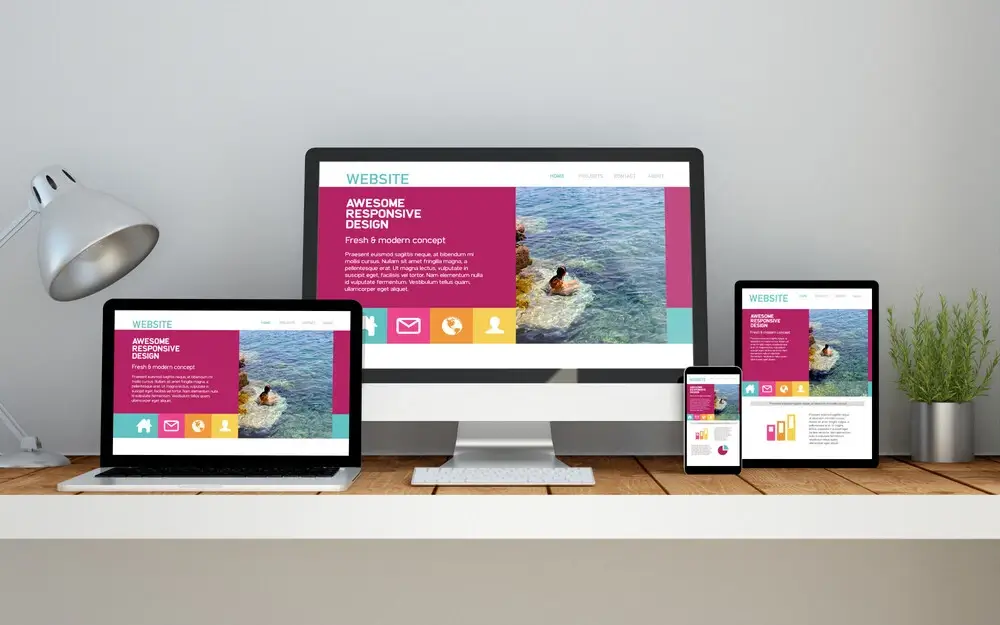
First Impressions Matter Enhanced User Experience Mobile Responsiveness
Contact Best Responsive Website Design Company in India
In the digital landscape, where the mobile experience reigns supreme, responsive web design emerges as the bridge connecting brands and their mobile audiences. Our Responsive Web Design Company is dedicated to perfecting this connection. As a Responsive Web Design Agency, we recognize that catering to diverse devices and user behaviors is essential. Our responsive web design services focus on creating adaptable, user-centric interfaces that seamlessly adjust to different screens, ensuring your brand’s message resonates regardless of the device used. With expertise as a responsive Website design company, we ensure your online presence remains consistent, engaging, and navigable, thereby closing the gap between your brand and the mobile audience you aim to captivate.
We prioritize mobile optimization, catering to the mobile-first mindset of today's users.
Content flows smoothly, ensuring readability and interaction, regardless of the user's device.
Visual elements remain consistent, creating a cohesive and appealing brand image across platforms.
A responsive website design contributes to positive user feedback, satisfaction, and repeat visits.
Marketing efforts are streamlined with a single, responsive website, avoiding the need for separate campaigns.
Content adapts to user needs, ensuring key information is delivered effectively, no matter the device.
Reach a broader audience across the world, connecting with users on the devices they prefer.
Our responsive designs are crafted with users in mind, delivering an optimal experience that encourages engagement.
Our responsive web design services play a pivotal role in driving business growth through enhanced online presence and user interactions.
We take immense pride in crafting digital adaptability through our unparalleled expertise and extensive experience in responsive web design services. As a distinguished responsive web design agency, we understand the critical importance of creating websites that seamlessly adjust to diverse devices and screens. Our Responsive Web Design Services go beyond aesthetics, focusing on delivering exceptional user experiences that remain consistent whether accessed on desktops, tablets, or smartphones. With a proven track record as a Responsive Website Design Company, our team employs innovative techniques to ensure your brand’s message is effectively conveyed to every user. Through meticulous attention to detail and a commitment to excellence, we unveil a digital landscape that bridges the gap between your brand and its target audience, offering a seamless journey of exploration and interaction.
Our team stands as pioneers in responsive web design services, equipped with a depth of expertise and experience in crafting adaptable digital solutions.
With an unwavering commitment to user experience, our responsive web design services prioritize creating interfaces that engage and convert on all devices.
We specialize in seamless transitions between different screens, ensuring your website remains visually appealing and functional across devices.
Our responsive web design expertise guarantees consistent branding and messaging, reinforcing your brand's identity across the digital spectrum.
We master the art of optimizing designs for diverse devices, guaranteeing a cohesive experience and improved engagement.
Our experience reflects a mobile-first mindset, essential in a digital landscape where mobile usage dominates.
Our responsive web designs are optimized for speed, enhancing user experience and reducing bounce rates.
Our responsive solutions incorporate conversion-focused elements, guiding users seamlessly towards desired actions.
We implement responsive designs to enhance your SEO efforts, resulting in improved search rankings and organic traffic.
A single responsive site optimizes resource utilization compared to maintaining separate mobile and desktop versions.
Our designs are forward-looking, adapting to emerging devices and technologies, ensuring long-term relevance.
Responsive design doesn't just stop at creation – we use data-driven insights to refine and enhance user interactions over time.
A: Responsive web design is an approach that ensures a website’s layout, images, and other elements adjust dynamically to provide an optimal viewing experience on various devices and screen sizes, from desktop computers to smartphones and tablets.
A: Responsive web design is important because it enables websites to adapt to the diverse range of devices that users use to access the internet. It ensures that users have a consistent and user-friendly experience, regardless of the device they are using.
A: Responsive web design uses fluid grids, flexible images, and media queries to automatically adjust the layout and design elements of a website based on the screen size of the device being used to view it. This allows the website to adapt seamlessly to different screen sizes.
A: Responsive web design offers several benefits, including improved user experience, reduced bounce rates, better SEO performance, consistent branding, easier maintenance, and a wider reach to mobile users.
A: While both terms are related, they are not the same. Mobile-friendly design focuses on making the website usable on mobile devices, while responsive web design takes this a step further by providing an optimal experience across a variety of screen sizes.
A: Responsive web design can positively impact SEO by providing a single URL for your content, eliminating the need for duplicate content on separate mobile sites. Google and other search engines also prefer responsive sites, potentially leading to higher search rankings.
A: Responsive websites can load faster if optimized properly. With responsive design, unnecessary elements can be hidden on smaller screens, leading to faster loading times and better user experiences on mobile devices.
A: In most cases, existing websites can be made responsive through redesign and coding adjustments. The extent of the changes required depends on the complexity of the existing design.
A: The cost of responsive web design can vary based on the complexity of your website and the work required to make it responsive. While initial costs might be higher, the long-term benefits, including improved user engagement and SEO performance, often make it a worthwhile investment.
A: You can test your website’s responsiveness by simply resizing your browser window on a desktop or laptop. Alternatively, you can use online tools that simulate different device screen sizes to see how your website adapts.
Whiz Web Solutions provides the best digital marketing & website design solutions for small and medium businesses in India. Our Team of Industry Experts will help you understand your business needs and provide you the best solutions
F24, CDF, Manjur Garhi, Aligarh, Uttar Pradesh 202122
WhatsApp: +91-701-7088-722
Copyright © 2018-2024 Whiz Web Solutions Pvt Ltd, India. All Rights Reserved.